The mark
was a shadow.
Delphix virtualizes and automates data so it flows without the bottleneck that has always slowed DevOps down. The symbol had to move the same way. It started as the DevOps infinity loop, extruded into three dimensions, then lit from an angle until it cast an X held inside a bracket. That shadow became the mark: fluid, dimensional, unmistakably DevOps.
Only someone who lived Delphix could find its mark.
The CEO didn't want an outside agency. He believed the symbol was already inside the company, and that whoever drew it had to understand the product in their bones. So I went looking for it by hand.
Three days, in graphite.
I spent three days at the CEO's beachfront house, sketching my way into the vision he kept describing: data that flows without bottlenecks, a language for the DevOps world, a form that felt strong and symbolic. No software. Just paper, until the shape started to appear.
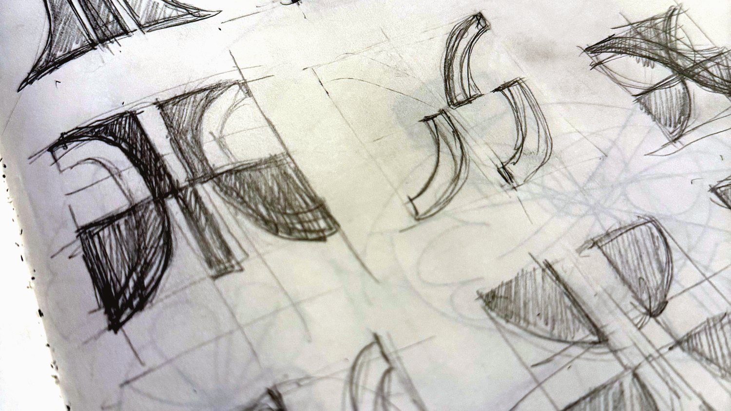
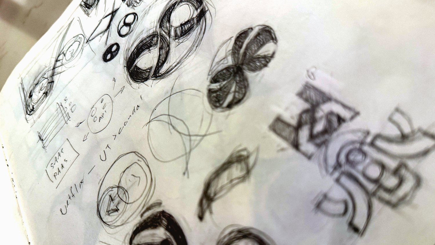
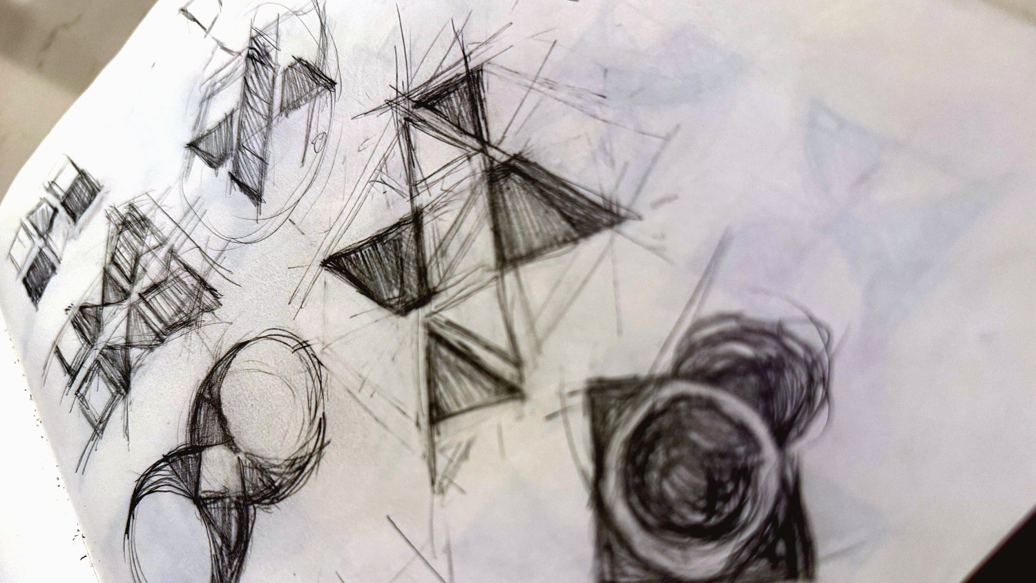
Graphite on paper · Infinity loops → extrusion → the cast X inside a bracket
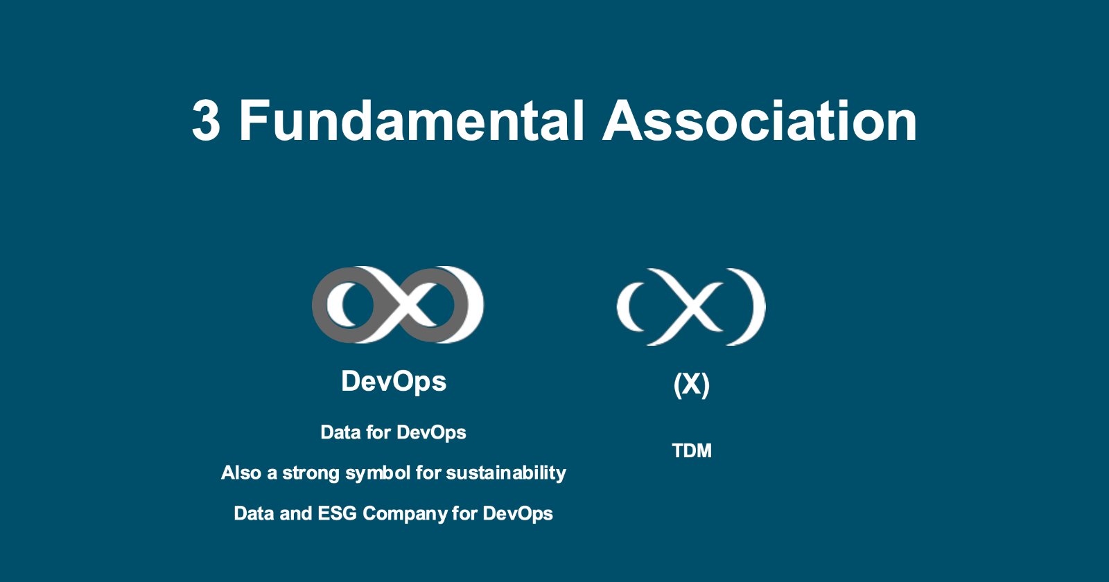
Two symbols, one shape.
The infinity loop already meant DevOps, and doubled as a symbol of sustainability, continuous and unbroken. Extrude it and the negative space resolves into (X), the TDM at the heart of the product. One form carried both meanings at once.
Making the case to the CEO.
Before the rebrand, still on the old deck, titled X Marks the Spot. I opened with the title set in a plain placeholder font, then revealed that a wordmark alone is not a brand. From there, four rules for a mark that lasts, and the proof that this one was one of a kind.
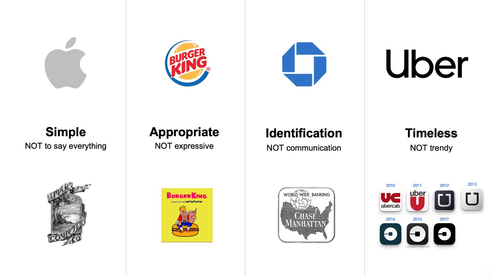
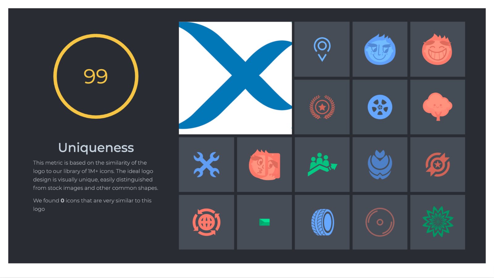
The argument · Simple, appropriate, identifiable, timeless · Scored 99 for uniqueness, zero look-alikes
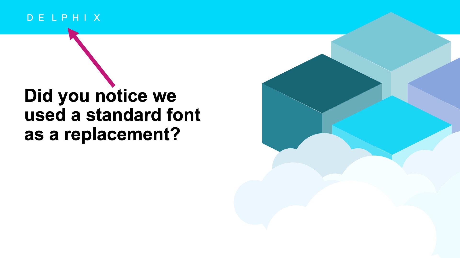
The pitch opener · August 2021
Teaching the mark to glow.
No reinvention. I started from the existing blues, added one color that could truly stand out, a single electric green, proved it held up on light and dark, then opened the whole system with diagonal gradients for endless on-brand combinations.
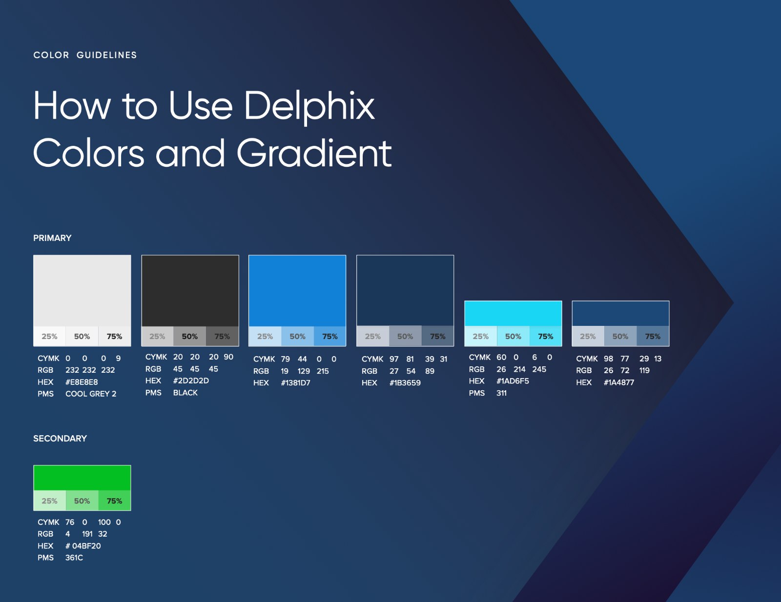
Palette · Primary blues, one secondary green reserved for the moments that matter
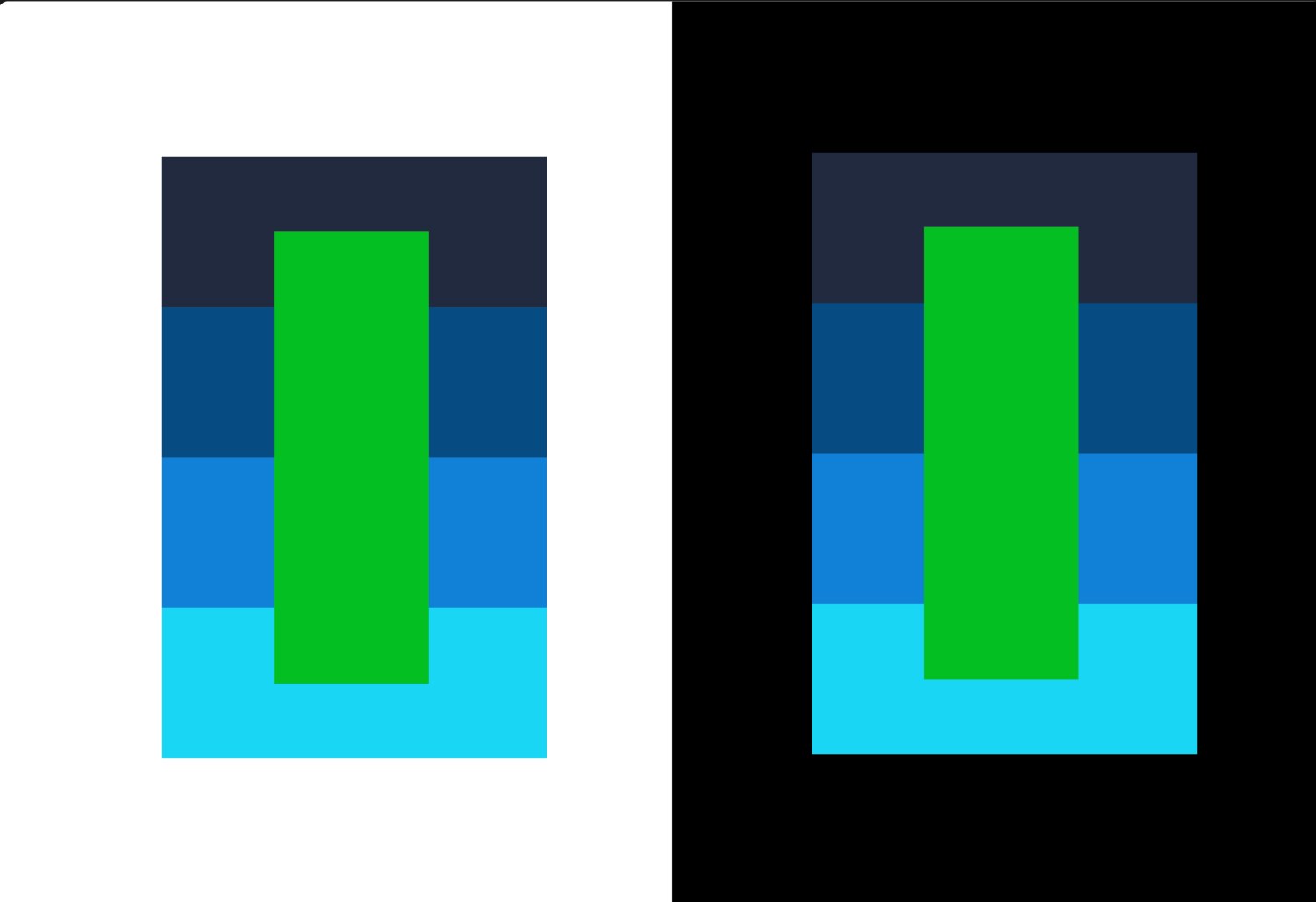
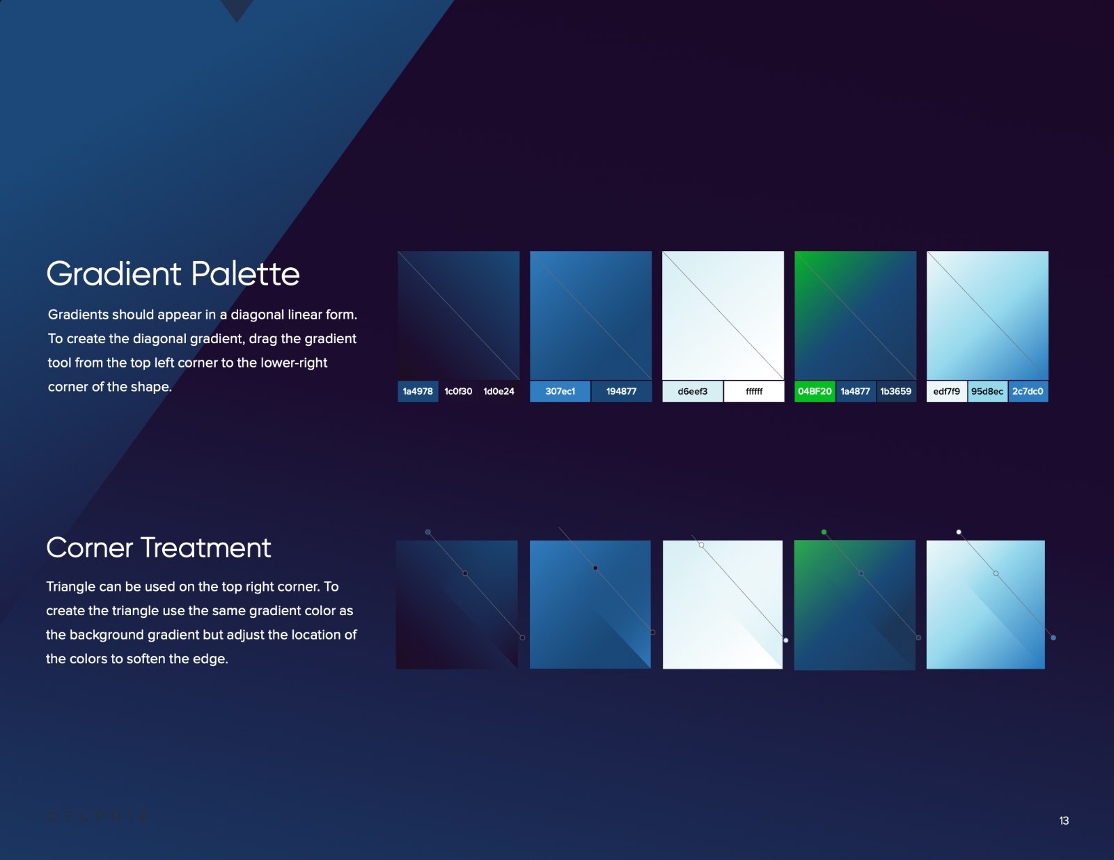
System · Contrast tested, then diagonal gradients dragged corner to corner
Written down so it would last.
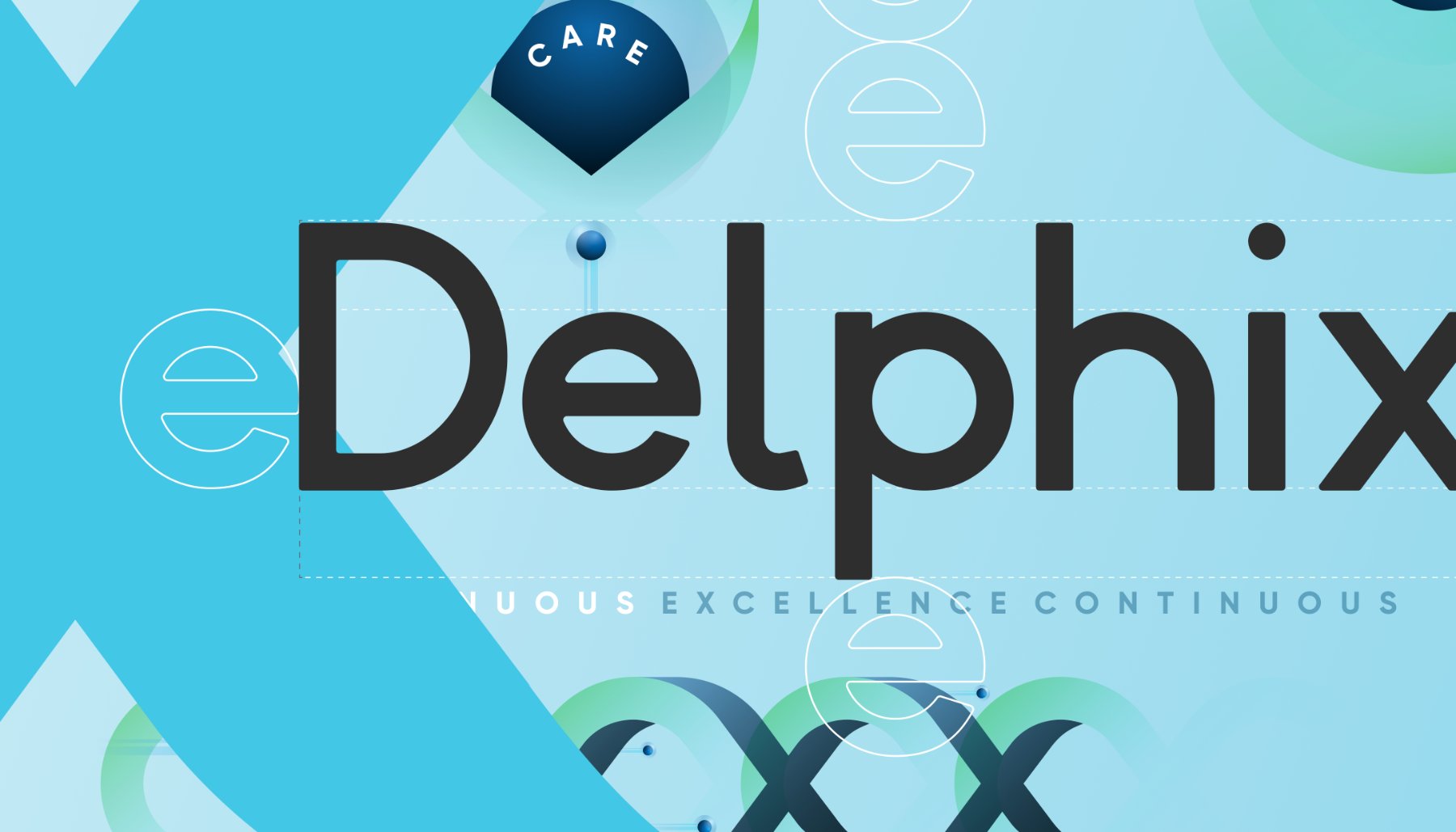
A documented brand, so it stayed consistent long after launch. Logo mechanics and clear space keyed to the letter e, a type hierarchy, and copy blocks anyone could follow without me in the room.
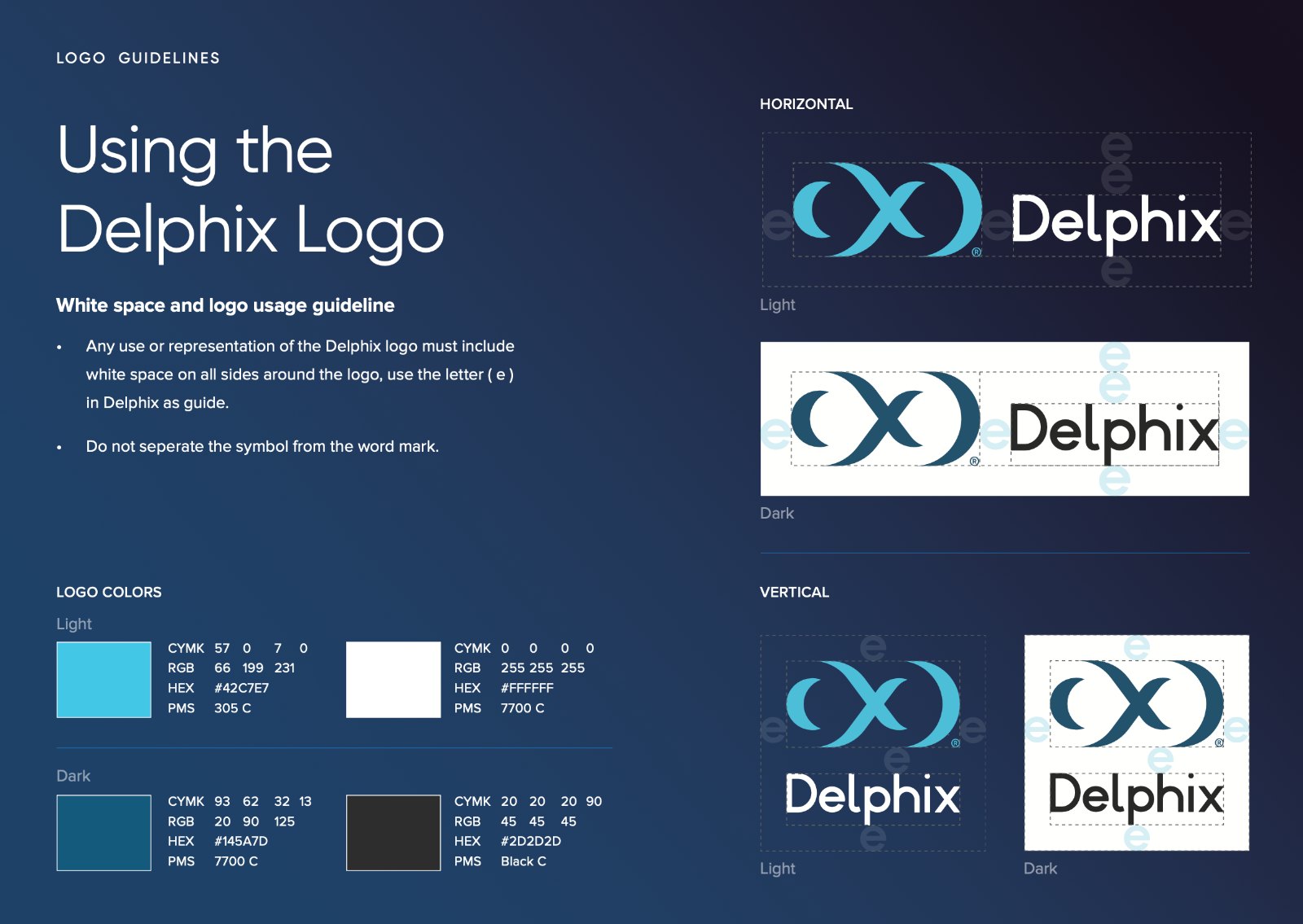
Logo guidelines · Lockups, clear space, and approved colors
A shape found by hand became the whole company.
The mark that started as a graphite shadow ran the rebrand: 300+ assets in 90 days, a story that cut the sales cycle from 12 months to 3, and a system the whole company could use without waiting on design.