Two arcs. One circle.
SustainableIT launched with a serious mission and a blank page. The identity had to make one idea unmistakable: technology and nature are not opposites. Built from zero, the mark closes the gap. Two half circles, green for the living world and blue for the built one, meeting as a single whole.

Uniting technology leaders to advance sustainability.
The mission gave the vision teeth: define sustainable transformation programs, author best practices, set standards and certifications, and raise awareness, so sustainability stops being someone else's problem to solve.
A vision spread that reads as a manifesto.
The opening pages set the tone for everything after: confident type, a calm forest, and the mark bleeding in from the edge. Credibility before decoration.
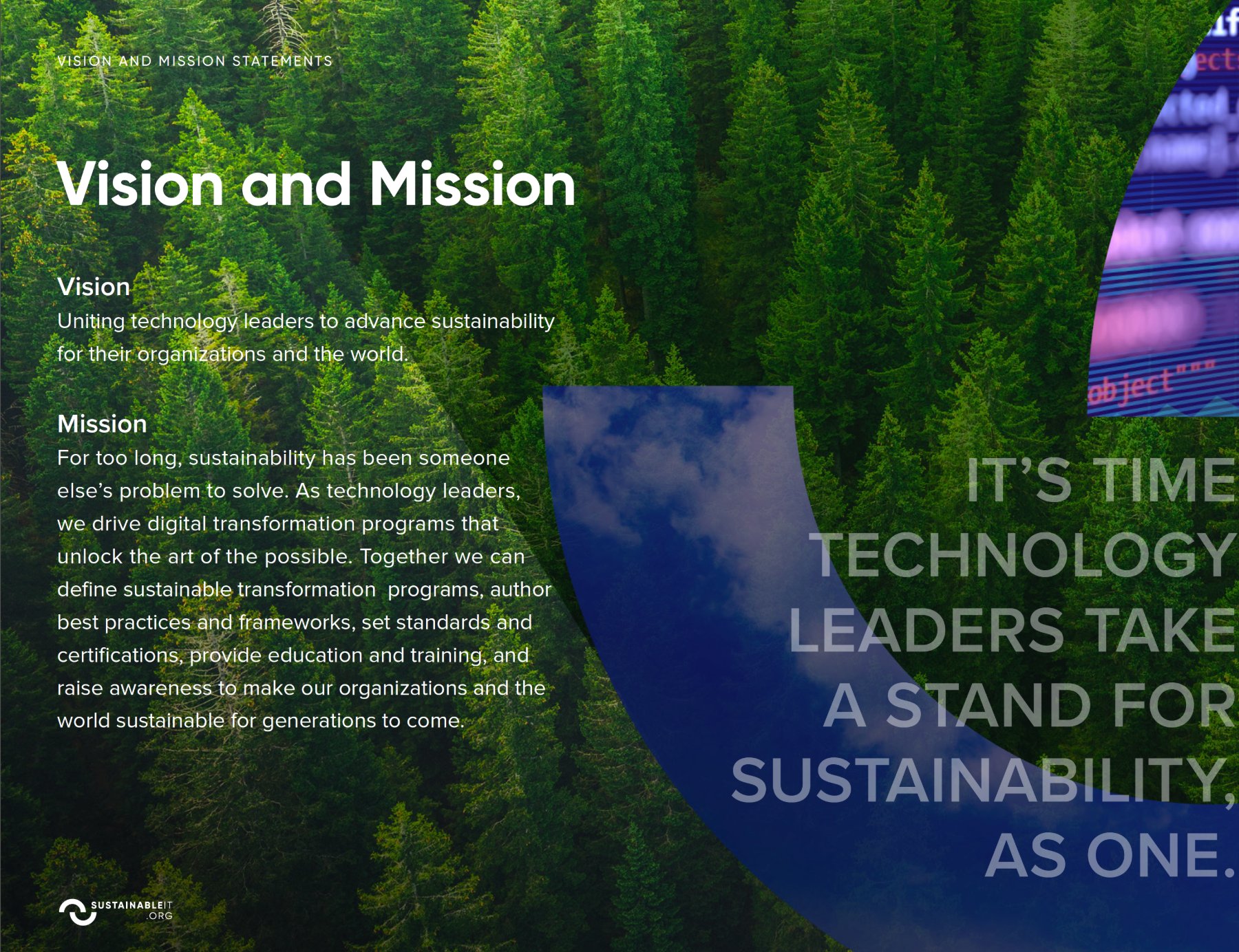
Brand guidelines · Vision and mission statements
One shape, endless windows.
The two arcs become a container. Drop in a forest and it reads as nature; drop in server code and it reads as technology. The system says when the mark may tile as a pattern, and when it may tilt, only ever bleeding off the edge, never floating.
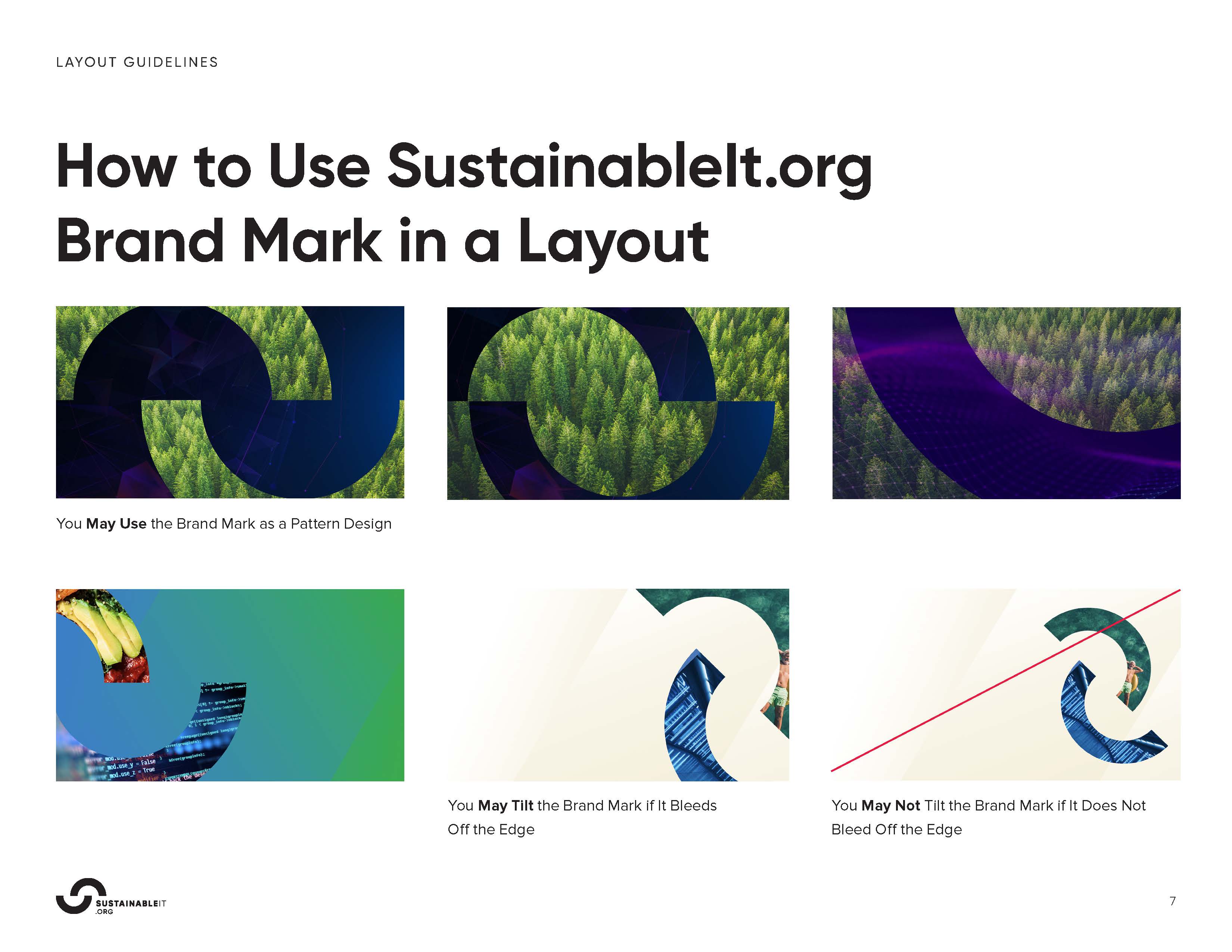
Layout guidelines · Using the brand mark in a composition
Rules a lean team could run without me.
Logo mechanics, a clear type hierarchy in Gilroy, and a diagonal gradient palette. Enough structure to stay consistent across two regions, loose enough to move fast.
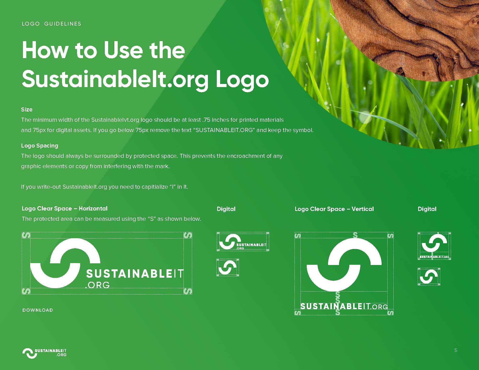
Logo guidelines · Sizing, clear space, horizontal and vertical lockups
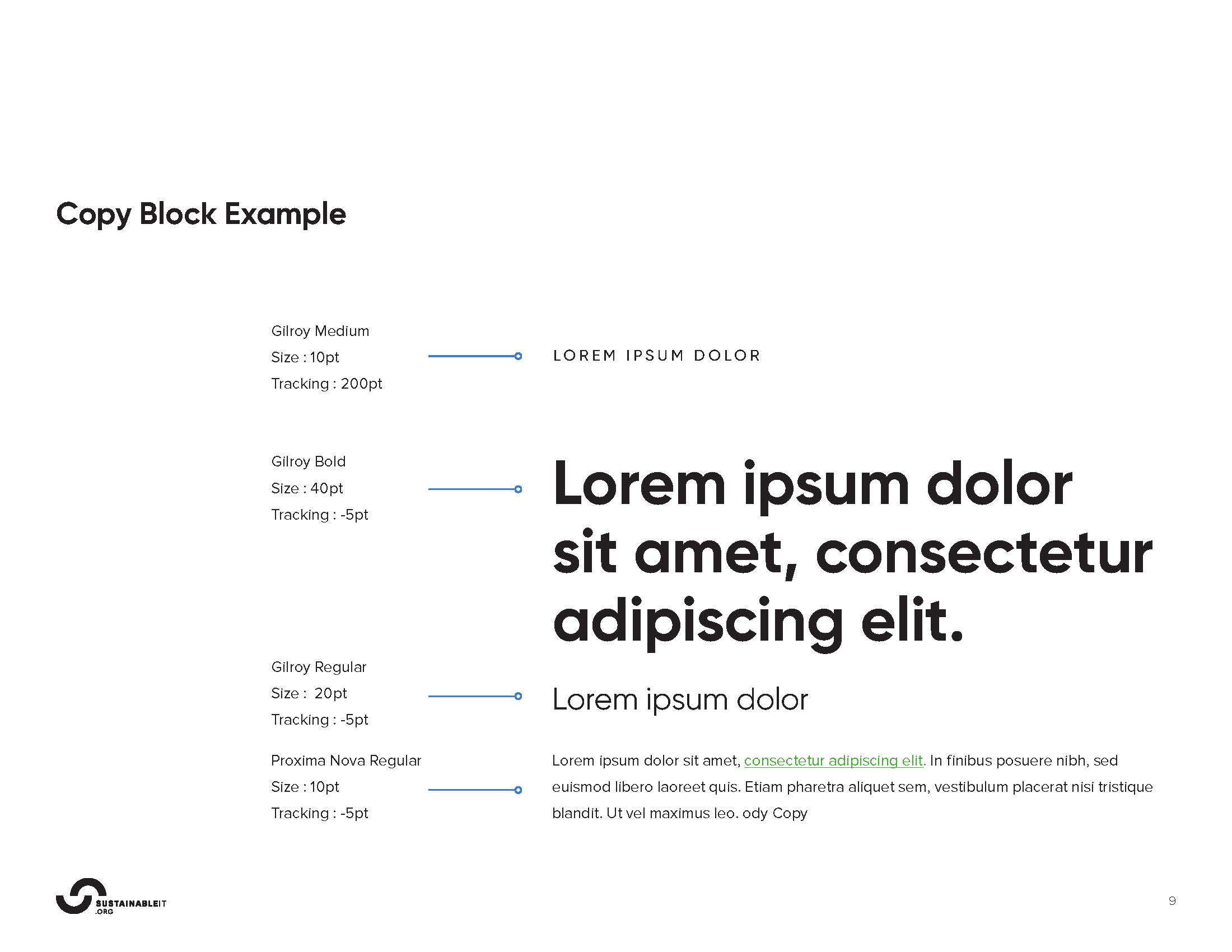
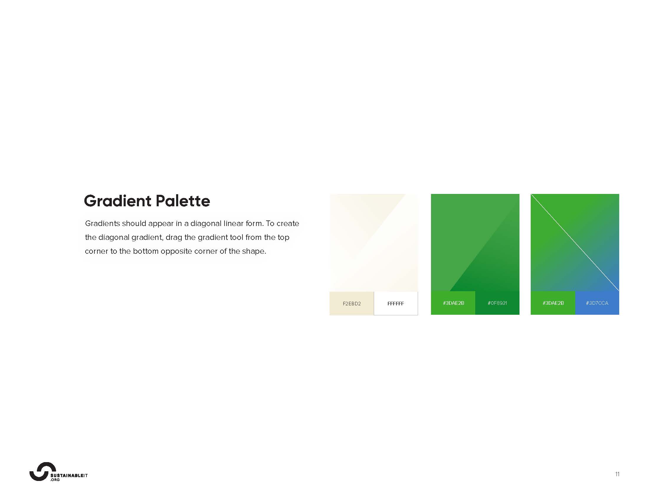
Type & color · Gilroy hierarchy · Diagonal gradient palette
240 standards, made legible.
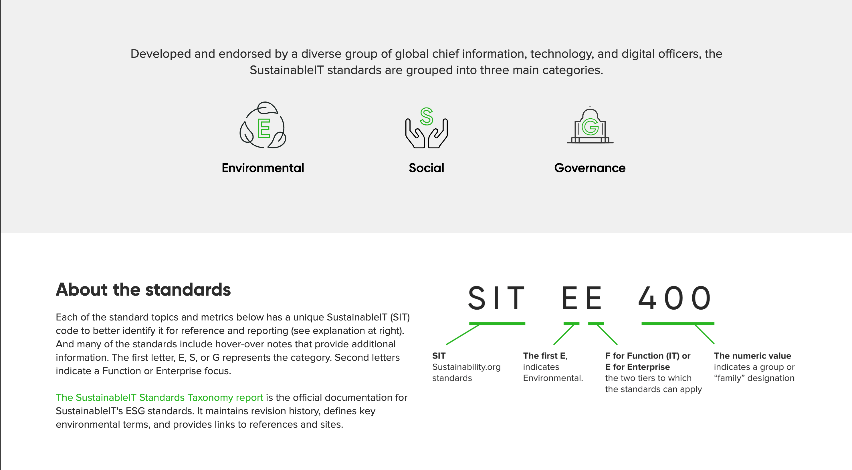
The brand was never the point. It existed to carry the work: the first ESG standards written for technology, 240 coded topics and metrics across Environmental, Social, and Governance, endorsed by CIOs and CTOs. The identity turned a dense framework into something leaders could actually read.
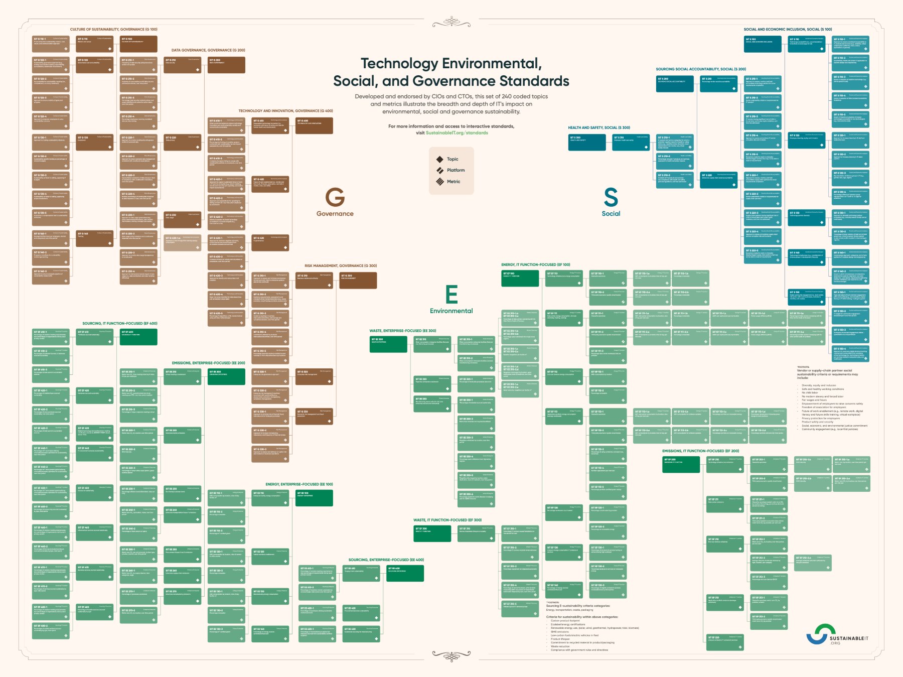
Applied system · Technology ESG Standards, 240 topics and metrics
From a business card to the live site.
The same system runs from the smallest touchpoint to the homepage. Recycled-material stationery, the org's own website, one coherent voice at every scale.
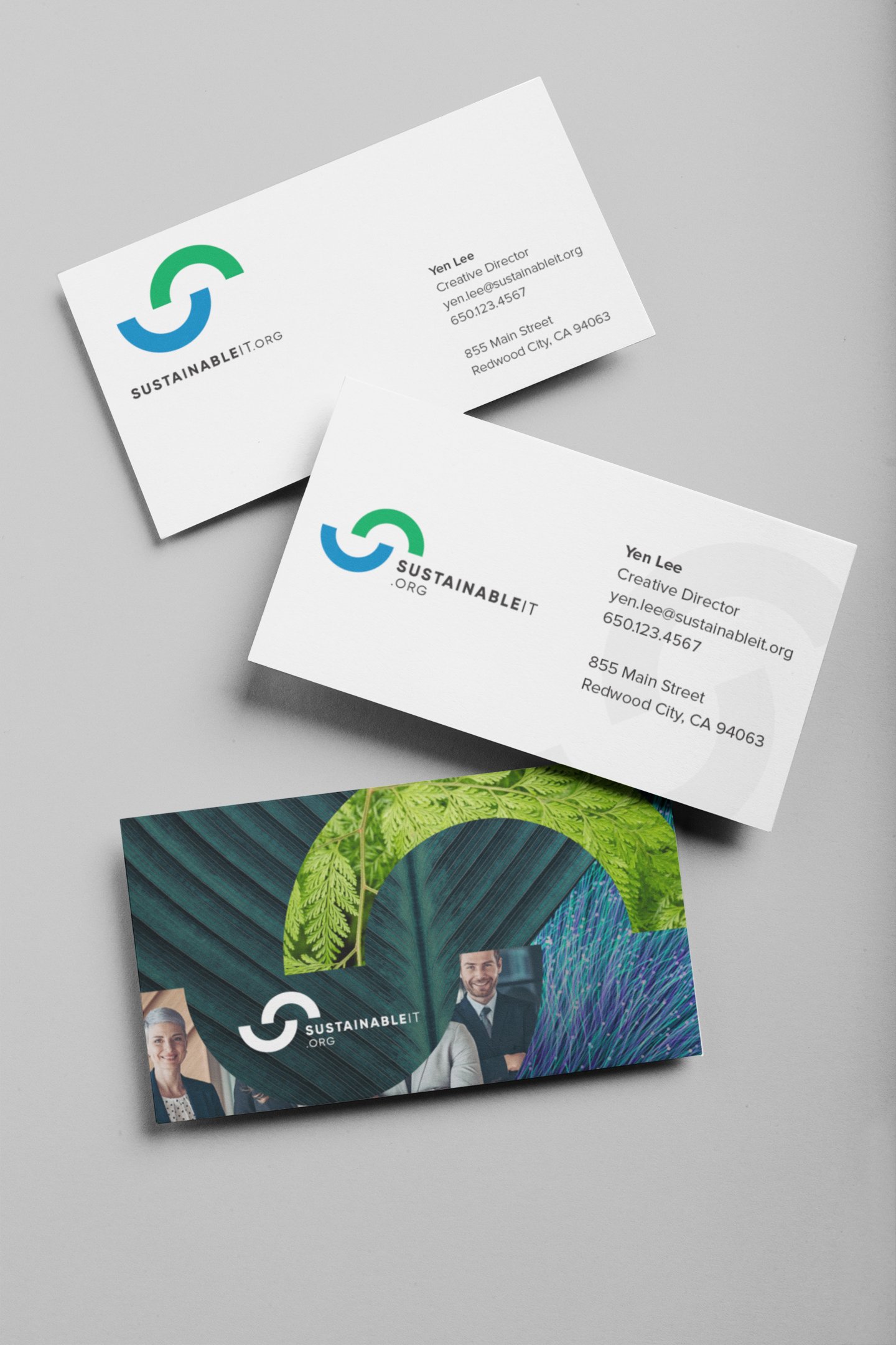
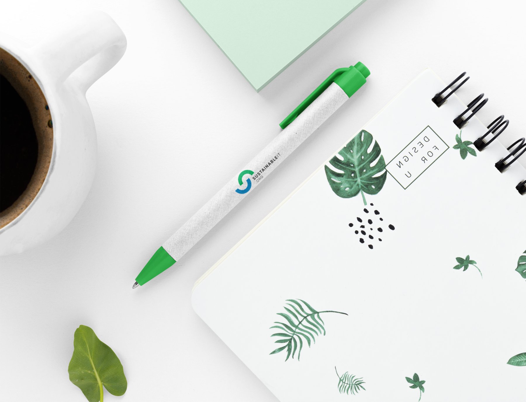
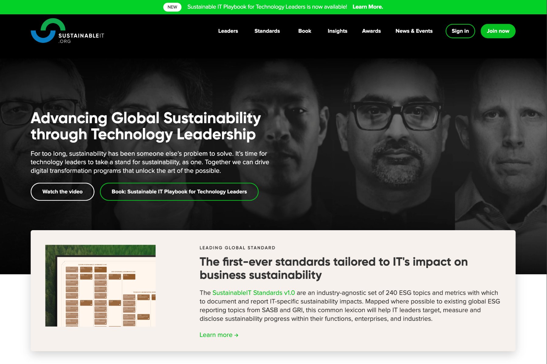
Applications · Stationery, collateral, and the live website
After five years, the brand had become the organization.
Built from zero, the identity gave a young nonprofit instant credibility, and never drifted while it scaled across two regions.